 Wealth, Income, and Power
This document presents details on the wealth and income distributions in the United States, and explains how we use these two distributions as power indicators.
Some of the information might be a surprise to many people. The most amazing numbers on income inequality come last, showing the change in the ratio of the average CEO's paycheck to that of the average factory worker over the past 40 years.
First, though, some definitions. Generally speaking, wealth is the value of everything a person or family owns, minus any debts. However, for purposes of studying the wealth distribution, economists define wealth in terms of marketable assets, such as real estate, stocks, and bonds, leaving aside consumer durables like cars and household items because they are not as readily converted into cash and are more valuable to their owners for use purposes than they are for resale (see Wolff, 2004, p. 4, for a full discussion of these issues). Once the value of all marketable assets is determined, then all debts, such as home mortgages and credit card debts, are subtracted, which yields a person's net worth. In addition, economists use the concept of financial wealth, which is defined as net worth minus net equity in owner-occupied housing. As Wolff (2004, p. 5) explains, "Financial wealth is a more 'liquid' concept than marketable wealth, since one's home is difficult to convert into cash in the short term. It thus reflects the resources that may be immediately available for consumption or various forms of investments."
We also need to distinguish wealth from income. Income is what people earn from wages, dividends, interest, and any rents or royalties that are paid to them on properties they own. In theory, those who own a great deal of wealth may or may not have high incomes, depending on the returns they receive from their wealth, but in reality those at the very top of the wealth distribution usually have the most income.
The Wealth Distribution
In the United States, wealth is highly concentrated in a relatively few hands. As of 2004, the top 1% of households (the upper class) owned 34.3% of all privately held wealth, and the next 19% (the managerial, professional, and small business stratum) had 50.3%, which means that just 20% of the people owned a remarkable 85%, leaving only 15% of the wealth for the bottom 80% (wage and salary workers). In terms of financial wealth (total net worth minus the value of one's home), the top 1% of households had an even greater share: 42.2%. Table 1 and Figure 1 present further details drawn from the careful work of economist Edward N. Wolff at New York University (2007).
| Table 1: Distribution of net worth and financial wealth in the |
| Total Net Worth | |||
|---|---|---|---|
| Top 1 percent | Next 19 percent | Bottom 80 percent | |
| 1983 | 33.8% | 47.5% | 18.7% |
| 1989 | 37.4% | 46.2% | 16.5% |
| 1992 | 37.2% | 46.6% | 16.2% |
| 1995 | 38.5% | 45.4% | 16.1% |
| 1998 | 38.1% | 45.3% | 16.6% |
| 2001 | 33.4% | 51.0% | 15.6% |
| 2004 | 34.3% | 50.3% | 15.3% |
| Financial Wealth | |||
| Top 1 percent | Next 19 percent | Bottom 80 percent | |
| 1983 | 42.9% | 48.4% | 8.7% |
| 1989 | 46.9% | 46.5% | 6.6% |
| 1992 | 45.6% | 46.7% | 7.7% |
| 1995 | 47.2% | 45.9% | 7.0% |
| 1998 | 47.3% | 43.6% | 9.1% |
| 2001 | 39.7% | 51.5% | 8.7% |
| 2004 | 42.2% | 50.3% | 7.5% |
|
Total assets are defined as the sum of: (1) the gross value of owner-occupied housing; (2) other real estate owned by the household; (3) cash and demand deposits; (4) time and savings deposits, certificates of deposit, and money market accounts; (5) government bonds, corporate bonds, foreign bonds, and other financial securities; (6) the cash surrender value of life insurance plans; (7) the cash surrender value of pension plans, including IRAs, Keogh, and 401(k) plans; (8) corporate stock and mutual funds; (9) net equity in unincorporated businesses; and (10) equity in trust funds. Total liabilities are the sum of: (1) mortgage debt; (2) consumer debt, including auto loans; and (3) other debt. From Wolff (2004 & 2007). |
Figure 1: Net worth and financial wealth distribution in the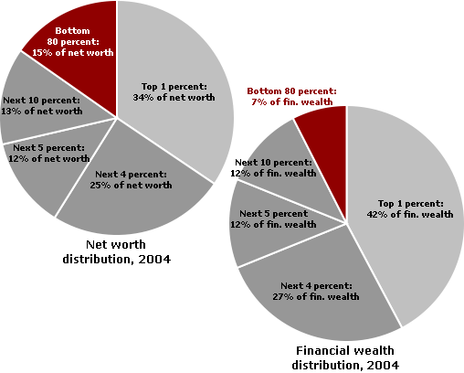 |
In terms of types of financial wealth, the top one percent of households have 36.7% of all privately held stock, 63.8% of financial securities, and 61.9% of business equity. The top 10% have 85% to 90% of stock, bonds, trust funds, and business equity, and over 75% of non-home real estate. Since financial wealth is what counts as far as the control of income-producing assets, we can say that just 10% of the people own the United States of America.
| Table 2: Wealth distribution by type of asset, 2004 |
| Investment Assets | |||
|---|---|---|---|
| Top 1 percent | Next 9 percent | Bottom 90 percent | |
| Business equity | 61.9% | 28.4% | 9.7% |
| Financial securities | 63.8% | 24.1% | 12.1% |
| Trusts | 47.7% | 33.9% | 18.5% |
| Stocks and mutual funds | 36.7% | 42.0% | 21.2% |
| Non-home real estate | 36.8% | 42.6% | 20.6% |
| TOTAL | 50.3% | 35.3% | 14.4% |
| Housing, Liquid Assets, Pension Assets, and Debt | |||
| Top 1 percent | Next 9 percent | Bottom 90 percent | |
| Deposits | 20.8% | 40.1% | 39.1% |
| Pension accounts | 13.5% | 44.8% | 41.7% |
| Life insurance | 21.4% | 36.0% | 42.7% |
| Principal residence | 9.8% | 28.2% | 62.0% |
| Debt | 7.2% | 19.9% | 73.0% |
| TOTAL | 12.2% | 33.5% | 54.3% |
| From Wolff (2007). | |||
Figure 2a: Wealth distribution by type of asset, 2004: 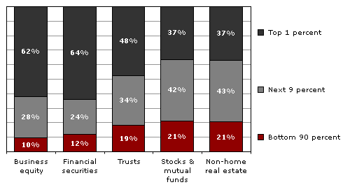 |
Figure 2b: Wealth distribution by type of asset, 2004: other assets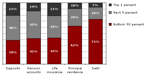 |
Figures on inheritance tell much the same story. According to a study published by the Federal Reserve Bank of Cleveland, only 1.6% of Americans receive $100,000 or more in inheritance. Another 1.1% receive $50,000 to $100,000. On the other hand, 91.9% receive nothing (Kotlikoff & Gokhale, 2000). Thus, the attempt by ultra-conservatives to eliminate inheritance taxes -- which they always call "death taxes" for P.R. reasons -- would take a huge bite out of government revenues for the benefit of less than 1% of the population. (It is noteworthy that some of the richest people in the country oppose this ultra-conservative initiative, suggesting that this effort is driven by anti-government ideology. In other words, few of the ultra-conservatives behind the effort will benefit from it in any material way.)
For the vast majority of Americans, their homes are by far the most significant wealth they possess. Figure 3 comes from the Federal Reserve Board's Survey of Consumer Finances (via Wolff, 2007) and compares the median income, total wealth (net worth, which is marketable assets minus debt), and non-home wealth (which earlier we called financial wealth) of White, Black, and Hispanic households in the U.S.
Figure 3: Income and wealth by race in the U.S.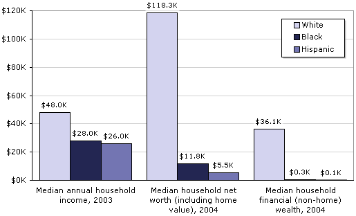 |
Besides illustrating the significance of home ownership as a measure of wealth, the graph also shows how much worse Black and Latino households are faring overall, whether we are talking about income or net worth. In 2004, the average white household had 10 times as much total wealth as the average African-American household, and 21 times as much as the average Latino household. If we exclude home equity from the calculations and consider only financial wealth, the ratios are more startling: 120:1 and 360:1, respectively. Extrapolating from these figures, we see that 69% of white families' wealth is in the form of their principal residence; for Blacks and Hispanics, the figures are 97% and 98%, respectively.
Historical context
Numerous studies show that the wealth distribution has been extremely concentrated throughout American history, with the top 1% already owning 40-50% in large port cities like Boston, New York, and Charleston in the 19th century (Keister, 2005). It was very stable over the course of the 20th century, although there were small declines in the aftermath of the New Deal and World II, when most people were working and could save a little money. There were progressive income tax rates, too, which took some money from the rich to help with government services.
Then there was a further decline, or flattening, in the 1970s, but this time in good part due to a fall in stock prices, meaning that the rich lost some of the value in their stocks. By the late 1980s, however, the wealth distribution was almost as concentrated as it had been in 1929, when the top 1% had 44.2% of all wealth. It has continued to edge up since that time, with a slight decline from 1998 to 2004, before the economy crashed in the late 2000s and little people got pushed down again. Table 3 and Figure 4 present the details from 1922 through 2004.
| Table 3: Share of wealth held by the Bottom 99% and Top 1% in the |
| Bottom 99 percent | Top 1 percent | |
|---|---|---|
| 1922 | 63.3% | 36.7% |
| 1929 | 55.8% | 44.2% |
| 1933 | 66.7% | 33.3% |
| 1939 | 63.6% | 36.4% |
| 1945 | 70.2% | 29.8% |
| 1949 | 72.9% | 27.1% |
| 1953 | 68.8% | 31.2% |
| 1962 | 68.2% | 31.8% |
| 1965 | 65.6% | 34.4% |
| 1969 | 68.9% | 31.1% |
| 1972 | 70.9% | 29.1% |
| 1976 | 80.1% | 19.9% |
| 1979 | 79.5% | 20.5% |
| 1981 | 75.2% | 24.8% |
| 1983 | 69.1% | 30.9% |
| 1986 | 68.1% | 31.9% |
| 1989 | 64.3% | 35.7% |
| 1992 | 62.8% | 37.2% |
| 1995 | 61.5% | 38.5% |
| 1998 | 61.9% | 38.1% |
| 2001 | 66.6% | 33.4% |
| 2004 | 65.7% | 34.3% |
| Sources: 1922-1989 data from Wolff (1996). 1992-2004 data from Wolff (2007). |
Figure 4: Share of wealth held by the Bottom 99% and Top 1% in the 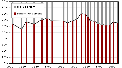 |
Here are some dramatic facts that sum up how the wealth distribution became even more concentrated between 1983 and 2004, in good part due to the tax cuts for the wealthy and the defeat of labor unions: Of all the new financial wealth created by the American economy in that 21-year-period, fully 42% of it went to the top 1%. A whopping 94% went to the top 20%, which of course means that the bottom 80% received only 6% of all the new financial wealth generated in the United States during the '80s, '90s, and early 2000s (Wolff, 2007).
The rest of the world
Thanks to a 2006 study by the World Institute for Development Economics Research -- using statistics for the year 2000 -- we now have information on the wealth distribution for the world as a whole, which can be compared to the United States and other well-off countries. The authors of the report admit that the quality of the information available on many countries is very spotty and probably off by several percentage points, but they compensate for this problem with very sophisticated statistical methods and the use of different sets of data. With those caveats in mind, we can still safely say that the top 10% of the world's adults control about 85% of global household wealth -- defined very broadly as all assets (not just financial assets), minus debts. That compares with a figure of 69.8% for the top 10% for the United States. The only industrialized democracy with a higher concentration of wealth in the top 10% than the United States is Switzerland at 71.3%. For the figures for several other Northern European countries and Canada, all of which are based on high-quality data, see Table 4.
| Table 4: Percentage of wealth held by the Top 10% of the adult population |
| country | wealth owned by top 10% |
|---|---|
| Switzerland | 71.3% |
| United States | 69.8% |
| Denmark | 65.0% |
| France | 61.0% |
| Sweden | 58.6% |
| UK | 56.0% |
| Canada | 53.0% |
| Norway | 50.5% |
| Germany | 44.4% |
| Finland | 42.3% |
The Relationship Between Wealth and Power
What's the relationship between wealth and power? To avoid confusion, let's be sure we understand they are two different issues. Wealth, as I've said, refers to the value of everything people own, minus what they owe, but the focus is on "marketable assets" for purposes of economic and power studies. Power, as explained elsewhere on this site, has to do with the ability (or call it capacity) to realize wishes, or reach goals, which amounts to the same thing, even in the face of opposition (Russell, 1938; Wrong, 1995). Some definitions refine this point to say that power involves Person A or Group A affecting Person B or Group B "in a manner contrary to B's interests," which then necessitates a discussion of "interests," and quickly leads into the realm of philosophy (Lukes, 2005, p. 30). Leaving those discussions for the philosophers, at least for now, how do the concepts of wealth and power relate?
First, wealth can be seen as a "resource" that is very useful in exercising power. That's obvious when we think of donations to political parties, payments to lobbyists, and grants to experts who are employed to think up new policies beneficial to the wealthy. Wealth also can be useful in shaping the general social environment to the benefit of the wealthy, whether through hiring public relations firms or donating money for universities, museums, music halls, and art galleries.
Second, certain kinds of wealth, such as stock ownership, can be used to control corporations, which of course have a major impact on how the society functions. Tables 5a and 5b show what the distribution of stock ownership looks like. Note how the top one percent's share of stock equity increased (and the bottom 80 percent's share decreased) between 2001 and 2004.
| Table 5a: Concentration of stock ownership in the |
| Percent of all stock owned: | |||
|---|---|---|---|
| Wealth class | 2001 | 2004 | |
| Top 1% | 33.5% | 36.7% | |
| Next 19% | 55.8% | 53.9% | |
| Bottom 80% | 10.7% | 9.4% | |
| Table 5b: Amount of stock owned by various wealth classes in the |
| Percent of households owning stocks worth: | |||
|---|---|---|---|
| Wealth class | More than $0 | More than $5,000 | More than $10,000 |
| Top 1% | 93.3% | 93.2% | 92.8% |
| 95-99% | 93.5% | 92.7% | 91.0% |
| 90-95% | 87.4% | 85.6% | 80.3% |
| 80-90% | 84.3% | 77.0% | 71.5% |
| 60-80% | 65.5% | 54.4% | 47.1% |
| 40-60% | 46.4% | 28.7% | 20.3% |
| 20-40% | 31.6% | 13.4% | 8.3% |
| Bottom 20% | 12.2% | 2.5% | 1.1% |
| TOTAL | 48.6% | 36.4% | 31.1% |
| Both tables' data from Wolff (2007). Includes direct ownership of stock shares and indirect ownership through mutual funds, trusts, and IRAs, Keogh plans, 401(k) plans, and other retirement accounts. All figures are in 2004 dollars. |
Third, just as wealth can lead to power, so too can power lead to wealth. Those who control a government can use their position to feather their own nests, whether that means a favorable land deal for relatives at the local level or a huge federal government contract for a new corporation run by friends who will hire you when you leave government. If we take a larger historical sweep and look cross-nationally, we are well aware that the leaders of conquering armies often grab enormous wealth, and that some religious leaders use their positions to acquire wealth.
There's a fourth way that wealth and power relate. For research purposes, the wealth distribution can be seen as the main "value distribution" within the general power indicator I call "who benefits." What follows in the next three paragraphs is a little long-winded, I realize, but it needs to be said because some social scientists -- primarily pluralists -- argue that who wins and who loses in a variety of policy conflicts is the only valid power indicator (Dahl, 1957, 1958; Polsby, 1980). And philosophical discussions don't even mention wealth or other power indicators (Lukes, 2005). (If you have heard it all before, or can do without it, feel free to skip ahead to the last paragraph of this section)
Here's the argument: if we assume that most people would like to have as great a share as possible of the things that are valued in the society, then we can infer that those who have the most goodies are the most powerful. Although some value distributions may be unintended outcomes that do not really reflect power, as pluralists are quick to tell us, the general distribution of valued experiences and objects within a society still can be viewed as the most publicly visible and stable outcome of the operation of power.
In American society, for example, wealth and well-being are highly valued. People seek to own property, to have high incomes, to have interesting and safe jobs, to enjoy the finest in travel and leisure, and to live long and healthy lives. All of these "values" are unequally distributed, and all may be utilized as power indicators. However, the primary focus with this type of power indicator is on the wealth distribution sketched out in the previous section.
The argument for using the wealth distribution as a power indicator is strengthened by studies showing that such distributions vary historically and from country to country, depending upon the relative strength of rival political parties and trade unions, with the United States having the most highly concentrated wealth distribution of any Western democracy except Switzerland. For example, in a study based on 18 Western democracies, strong trade unions and successful social democratic parties correlated with greater equality in the income distribution and a higher level of welfare spending (Stephens, 1979).
And now we have arrived at the point I want to make. If the top 1% of households have 30-35% of the wealth, that's 30 to 35 times what we would expect by chance, and so we infer they must be powerful. And then we set out to see if the same set of households scores high on other power indicators (it does). Next we study how that power operates, which is what most articles on this site are about. Furthermore, if the top 20% have 84% of the wealth (and recall that 10% have 85% to 90% of the stocks, bonds, trust funds, and business equity), that means that the United States is a power pyramid. It's tough for the bottom 80% -- maybe even the bottom 90% -- to get organized and exercise much power.
Income and Power
The income distribution also can be used as a power indicator. As Table 6 shows, it is not as concentrated as the wealth distribution, but the top 1% of income earners did receive 17% of all income in the year 2003. That's up from 12.8% for the top 1% in 1982, which is quite a jump, and it parallels what is happening with the wealth distribution. This is further support for the inference that the power of the corporate community and the upper class have been increasing in recent decades.
| Table 6: Distribution of income in the |
| Income | |||
|---|---|---|---|
| Top 1 percent | Next 19 percent | Bottom 80 percent | |
| 1982 | 12.8% | 39.1% | 48.1% |
| 1988 | 16.6% | 38.9% | 44.5% |
| 1991 | 15.7% | 40.7% | 43.7% |
| 1994 | 14.4% | 40.8% | 44.9% |
| 1997 | 16.6% | 39.6% | 43.8% |
| 2000 | 20.0% | 38.7% | 41.4% |
| 2003 | 17.0% | 40.8% | 42.2% |
| From Wolff (2007). | |||
The rising concentration of income can be seen in a special New York Times analysis of an Internal Revenue Service report on income in 2004. Although overall income had grown by 27% since 1979, 33% of the gains went to the top 1%. Meanwhile, the bottom 60% were making less: about 95 cents for each dollar they made in 1979. The next 20% - those between the 60th and 80th rungs of the income ladder -- made $1.02 for each dollar they earned in 1979. Furthermore, the Times author concludes that only the top 5% made significant gains ($1.53 for each 1979 dollar). Most amazing of all, the top 0.1% -- that's one-tenth of one percent -- had more combined pre-tax income than the poorest 120 million people (Johnston, 2006).
But the increase in what is going to the few at the top did not level off, even with all that. As of 2007, income inequality in the United States was at an all-time high for the past 95 years, with the top 0.01% -- that's one-hundredth of one percent -- receiving 6% of all U.S. wages, which is double what it was for that tiny slice in 2000; the top 10% received 49.7%, the highest since 1917 (Saez, 2009).
A key factor behind the high concentration of income, and the likely reason that the concentration has been increasing, can be seen by examining the distribution of what is called "capital income": income from capital gains, dividends, interest, and rents. In 2003, just 1% of all households -- those with after-tax incomes averaging $701,500 -- received 57.5% of all capital income, up from 40% in the early 1990s. On the other hand, the bottom 80% received only 12.6% of capital income, down by nearly half since 1983, when the bottom 80% received 23.5%. Figure 5 and Table 7 provide the details.
Figure 5: Share of capital income earned by top 1% and bottom 80%, 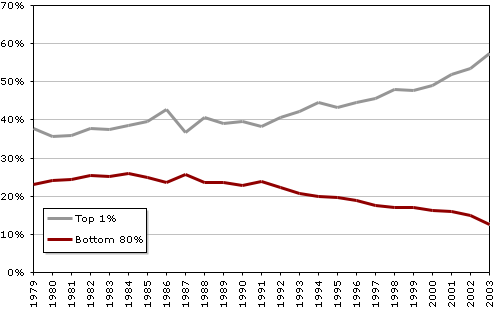 |
| Table 7: Share of capital income flowing to households in various income categories |
| Top 1% | Top 5% | Top 10% | Bottom 80% | |
|---|---|---|---|---|
| 1979 | 37.8% | 57.9% | 66.7% | 23.1% |
| 1981 | 35.8% | 55.4% | 64.6% | 24.4% |
| 1983 | 37.6% | 55.2% | 63.7% | 25.1% |
| 1985 | 39.7% | 56.9% | 64.9% | 24.9% |
| 1987 | 36.7% | 55.3% | 64.0% | 25.6% |
| 1989 | 39.1% | 57.4% | 66.0% | 23.5% |
| 1991 | 38.3% | 56.2% | 64.7% | 23.9% |
| 1993 | 42.2% | 60.5% | 69.2% | 20.7% |
| 1995 | 43.2% | 61.5% | 70.1% | 19.6% |
| 1997 | 45.7% | 64.1% | 72.6% | 17.5% |
| 1999 | 47.8% | 65.7% | 73.8% | 17.0% |
| 2001 | 51.8% | 67.8% | 74.8% | 16.0% |
| 2003 | 57.5% | 73.2% | 79.4% | 12.6% |
| Adapted from Shapiro & Friedman (2006). | ||||
Another way that income can be used as a power indicator is by comparing average CEO annual pay to average factory worker pay, something that Business Week has been doing for many years now. The ratio of CEO pay to factory worker pay rose from 42:1 in 1960 to as high as 531:1 in 2000, at the height of the stock market bubble, when CEOs were cashing in big stock options;. It was at 411:1 in 2005. By way of comparison, the same ratio is about 25:1 in Europe. The changes in the American ratio are displayed in Figure 6.
Figure 6: CEOs' pay as a multiple of the average 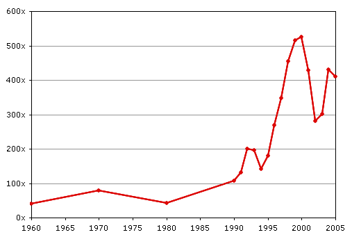 |
It's even more revealing to compare the actual rates of increase of the salaries of CEOs and ordinary workers; from 1990 to 2005, CEOs' pay increased almost 300% (adjusted for inflation), while production workers gained a scant 4.3%. The purchasing power of the federal minimum wage actually declined by 9.3%, when inflation is taken into account. These startling results are illustrated in Figure 7.
Figure 7: CEOs' average pay, production workers' average pay, the 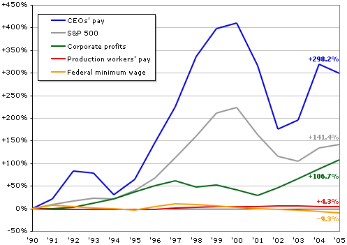 |
| Source: Executive Excess 2006, the 13th Annual CEO Compensation Survey from the Institute for Policy Studies and United for a Fair Economy. |
If you wonder how such a large gap could develop, the proximate, or most immediate, factor involves the way in which CEOs now are able to rig things so that the board of directors, which they help select -- and which includes some fellow CEOs on whose boards they sit -- gives them the pay they want. The trick is in hiring outside experts, called "compensation consultants," who give the process a thin veneer of economic respectability.
The process has been explained in detail by a retired CEO of DuPont, Edgar S. Woolard, Jr., who is now chair of the New York Stock Exchange's executive compensation committee. His experience suggests that he knows whereof he speaks, and he speaks because he's concerned that corporate leaders are losing respect in the public mind. He says that the business page chatter about CEO salaries being set by the competition for their services in the executive labor market is "bull." As to the claim that CEOs deserve ever higher salaries because they "create wealth," he describes that rationale as a "joke," says the New York Times (Morgenson, 2005, Section 3, p. 1).
Here's how it works, according to Woolard:
The compensation committee [of the board of directors] talks to an outside consultant who has surveys you could drive a truck through and pay anything you want to pay, to be perfectly honest. The outside consultant talks to the human resources vice president, who talks to the CEO. The CEO says what he'd like to receive. It gets to the human resources person who tells the outside consultant. And it pretty well works out that the CEO gets what he's implied he thinks he deserves, so he will be respected by his peers. (Morgenson, 2005.)
The board of directors buys into what the CEO asks for because the outside consultant is an "expert" on such matters. Furthermore, handing out only modest salary increases might give the wrong impression about how highly the board values the CEO. And if someone on the board should object, there are the three or four CEOs from other companies who will make sure it happens. It is a process with a built-in escalator.
As for why the consultants go along with this scam, they know which side their bread is buttered on. They realize the CEO has a big say-so on whether or not they are hired again. So they suggest a package of salaries, stock options and other goodies that they think will please the CEO, and they, too, get rich in the process. And certainly the top executives just below the CEO don't mind hearing about the boss's raise. They know it will mean pay increases for them, too. (For an excellent detailed article on the main consulting firm that helps CEOs and other corporate executives raise their pay, check out the New York Times article entitled "America's Corporate Pay Pal", which supports everything Woolard of DuPont claims and adds new information.)
There's a much deeper power story that underlies the self-dealing and mutual back-scratching by CEOs now carried out through interlocking directorates and seemingly independent outside consultants. It probably involves several factors. At the least, on the worker side, it reflects an increasing lack of power following the all-out attack on unions in the 1960s and 1970s, which is explained in detail by the best expert on recent American labor history, James Gross (1995), a labor and industrial relations professor at Cornell. That decline in union power made possible and was increased by both outsourcing at home and the movement of production to developing countries, which were facilitated by the break-up of the New Deal coalition and the rise of the New Right (Domhoff, 1990, Chapter 10). It signals the shift of the United States from a high-wage to a low-wage economy, with professionals protected by the fact that foreign-trained doctors and lawyers aren't allowed to compete with their American counterparts in the direct way that low-wage foreign-born workers are.
On the other side of the class divide, the rise in CEO pay may reflect the increasing power of chief executives as compared to major owners and stockholders in general, not just their increasing power over workers. CEOs may now be the center of gravity in the corporate community and the power elite, displacing the leaders in wealthy owning families (e.g., the second and third generations of the Walton family, the owners of Wal-Mart). True enough, the CEOs are sometimes ousted by their generally go-along boards of directors, but they are able to make hay and throw their weight around during the time they are king of the mountain. (It's really not much different than that old children's game, except it's played out in profit-oriented bureaucratic hierarchies, with no other sector of society, like government, willing or able to restrain the winners.)
The claims made in the previous paragraph need much further investigation. But they demonstrate the ideas and research directions that are suggested by looking at the wealth and income distributions as indicators of power.
Further Information
- The 2007 Wolff paper is on-line at http://www.levy.org/vdoc.aspx?docid=929
- The Census Bureau report is on line at http://www.census.gov/hhes/www/wealth/wealth.html
- The World Institute for Development Economics Research (UNU-WIDER) report on household wealth throughout the world is available at http://tinyurl.com/wdhw08; see the WIDER site for more about their research.
- For good summaries of other information on wealth and income, and for information on the estate tax, see the United For A Fair Economy site at http://www.faireconomy.org/
- The New York Times ran an excellent series of articles on executive compensation in the fall of 2006 entitled "Gilded Paychecks." Look for it by searching the archives on NYTimes.com.
- To see a video of Ed Woolard giving his full speech about executive compensation, go to http://www.compensationstandards.com/nonmember/EdWoolard_video.asp (WMV file, may not be viewable on all platforms/browsers)
- The Shapiro & Friedman paper on capital income, along with many other reports on the federal budget and its consequences, are available at the Center on Budget and Policy Priorities site: http://www.cbpp.org/pubs/recent.html
- The AFL-CIO maintains a site called "Executive Paywatch," which summarizes information about the salary disparity between executives and other workers: http://www.aflcio.org/paywatch/
- More raw numbers about the unequal wealth distribution in the U.S. are available at Inequality.org: http://www.inequality.org/facts.html
- Emmanuel Saez, Professor of Economics at UC Berkeley, has written or co-authored a number of papers on income inequality and related topics: http://elsa.berkeley.edu/~saez/
References
Anderson, S., Cavanagh, J., Klinger, S., & Stanton, L. (2005). Executive Excess 2005: Defense Contractors Get More Bucks for the Bang. Washington, DC: Institute for Policy Studies / United for a Fair Economy.
Dahl, R. A. (1957). The concept of power. Behavioral Science, 2, 202-210.
Dahl, R. A. (1958). A critique of the ruling elite model. American Political Science Review, 52, 463-469.
Davies, J. B., Sandstrom, S., Shorrocks, A., & Wolff, E. N. (2006). The World Distribution of Household Wealth. Helsinki: World Institute for Development Economics Research.
Domhoff, G. W. (1990). The Power Elite and the State: How Policy Is Made in America. Hawthorne, NY: Aldine de Gruyter.
Gross, J. A. (1995). Broken Promise: The Subversion of U.S. Labor Relations Policy. Philadelphia: Temple University Press.
Johnston, D. C. (2006, November 28). '04 Income in U.S. Was Below 2000 Level.
Keister, L. (2005). Getting Rich: A Study of Wealth Mobility in America. New York: Cambridge University Press.
Kotlikoff, L., & Gokhale, J. (2000). The Baby Boomers' Mega-Inheritance: Myth or Reality? Cleveland: Federal Reserve Bank of Cleveland.
Lukes, S. (2005). Power: A Radical View (Second ed.). New York: Palgrave.
Morgenson, G. (2005, October 23). How to slow runaway executive pay. New York Times, Section 3, p. 1.
Polsby, N. (1980). Community Power and Political Theory (Second ed.). New Haven, CT: Yale University Press.
Russell, B. (1938). Power: A New Social Analysis. London: Allen and Unwin.
Saez, E. (2009). Striking It Richer: The Evolution of Top Incomes in the United States (Update with 2007 Estimates). Retrieved August 28, 2009 from http://elsa.berkeley.edu/
Saez, E., & Piketty, T. (2003). Income Inequality in the United States, 1913-1998. Quarterly Journal of Economics, 118, 1-39.
Shapiro, I., & Friedman, J. (2006). New, Unnoticed CBO Data Show Capital Income Has Become Much More Concentrated at the Top. Washington, DC: Center on Budget and Policy Priorities.
Stephens, J. (1979). The Transition from Capitalism to Socialism. London: Macmillan.
Wolff, E. N. (1996). Top Heavy. New York: The New Press.
Wolff, E. N. (2004). Changes in Household Wealth in the 1980s and 1990s in the U.S. Unpublished manuscript.
Wolff, E. N. (2007). Recent Trends in Household Wealth in the United States: Rising Debt and the Middle-Class Squeeze Annandale-on-Hudson, NY: The Levy Economics Institute.
Wrong, D. (1995). Power: Its Forms, Bases, and Uses (Second ed.). New Brunswick: Transaction Publishers.
All content ©2009 G. William Domhoff, unless otherwise noted. Unauthorized reproduction prohibited.
To purchase the Book: Who Rules America by G. William Domhoff - AMAZON.com Books
Reprinted with the permission of G. William Domhoff - 09/23/09